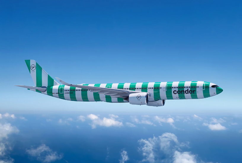

Stripes & Aircrafts – In conversation with Remo Masala
Table of Contents
It was an absolute privilege to engage in a conversation with Remo Masala, delving into the fascinating story of how he orchestrated a transformation in Condor Airlines‘ branding, leaving an indelible mark on the world of holidaymakers and travellers.
1. Remo,Condor is vacation and vacation is striped. Actually a simple equation – was that the basis of the idea for the striped look?
2. It was therefore necessary to develop traditions further. Condor is a strong brand, why is a rebranding the right thing to do right now?
Condor has demonstrated impressive brand discipline over the years since its creation: Otl Aicher, probably the most famous German graphic designer and brand maker of the 1960s, developed the figurative mark and the lettering – since then Condor has been yellow and had the condor in a circle as its signet. This tradition was then broken by belonging to corporations at the end of the 90s. Sometimes Thomas Cook stood on the planes, then Condor powered by Thomas Cook and in the following years a colorful mix of appearances emerged. With 80 percent of the aircraft currently due for a new paint job – after all, they have to be painted about every seven years – the time was now more ripe than ever to decide on the future of the brand.
3. Condor is known for their passion: We love what we do! That's why our claim for years was "We love flies!". In the future we will have a new claim. Why is he better suited to us?
4. A striped livery on an aeroplane was a bold move; what compelled you to rebrand a brand like "Condor" with a history spanning more than 60 years?
As a creative agency, we are happy about every client who wants simple and perfect solutions for complex issues. It wasn’t just about stripes, it was about the repositioning of a brand and the understanding of the employees for this transformation. Stripes are one thing you see. Our interior design of the cabin is another important change. But the service of the staff and the culture of the company, these are the real changes that the customer feels and that make the whole thing perfect.
5. What's your take on future-proof rebranding, and how can one achieve it?
Related posts
Branding is the most important aspect of any business
Table of Contents Branding is the most important aspect of any business; it gives essence to your pr


