- Business Intelligence
Decoding the most unused feature of Power BI – the Performance Analyzer
The world is moving around with data-driven decision-making at an exponential pace, making it a void to fill in the technology-driven decisions. Microsoft Power BI, one of the leading technologies, is impacting these data-driven transformations to accelerate this process and derive rigorous outcomes.
In Brief
- The most amusing features of Power BI
- Why does Power BI report performance matters?
- Did you know about the performance Analyzer?
- Are you wondering how to use the Performance Analyzer?
- Pro Tip: Why do we use a blank page in the Performance Analyzer
The most amusing features of Power BI include;
- Connectors to all the data sources.
- Data Query Editor transforms and cleans data and creates a data model.
- Create visuals that include graphs and charts, which help users quickly understand the data.
- Create and share reports (collection of visuals and KPIs) easily.
Why does Power BI report performance matters?
The ease of making reports is justified by the technology we are talking about but have we ever considered analysing the performance of our reports generated using Power BI Desktop? Yes, we can examine our reports generated using Power Bi Desktop. This tool is one of the most potent tools to enrich usability.
We are talking about the most unused feature of Power BI, viz. Performance Analyzer. When developing reports in Power BI Desktop (or any software for that matter), fast load times are critical for building trust with stakeholders and ensuring user adoption. Long load times and poor user experience can discourage users from incorporating solutions into their daily processes.
Did you know about the performance Analyzer?
Performance Analyzer inspects and displays the time required to update or refresh all visuals that user interactions initiate. It then presents the data so you can view, drill down, or export the results. Performance Analyzer can assist you in identifying visuals affecting your reports’ performance and determining the cause of the impact
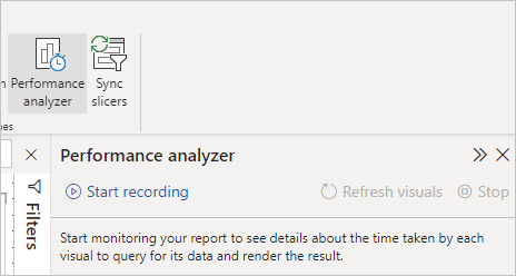
Are you wondering how to use the Performance Analyzer?
We have tried to make the process easy for you to understand
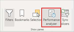
- Select the View ribbon and Performance Analyzer in Power BI Desktop to open the Performance Analyzer pane.
- When you select it, the Performance Analyzer appears in its pane to the right of the report canvas.
- The performance Analyzer calculates the amount of time it takes to update report elements due to any user interaction that results in a query (including the time it takes to create or update a visual). For example, adjusting a slicer necessitates modifying the slicer visual, sending a question to the data model, and updating affected visuals due to the new settings.
Simply select Start recording to have the Performance Analyzer start recording.
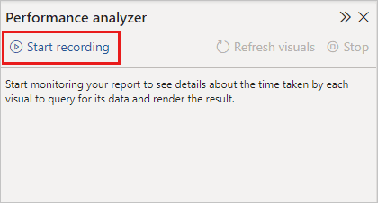
Any actions you perform in the report are displayed and logged in the Performance Analyzer pane, allowing Power BI to load the visual. A report, for example, takes a long time to refresh. The performance Analyzer can determine which visual is at fault and bring it to your notice.
When you start recording, the Start recording button becomes greyed out (inactive because you’ve already begun to record), while the Stop button becomes active.
The performance Analyzer collects and displays real-time performance measurement data. As a result, whenever you click on a visual, move a slicer, or interact in any other way, the Performance Analyzer immediately displays the performance results in its pane. If the pane contains more information than can be displayed, a scroll bar appears to allow you to access it.
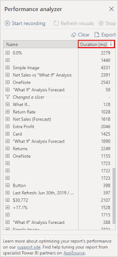
Each interaction in the pane has a section identifier describing the action that triggered the log entries. The interaction in the following image was that the users changed a slicer.
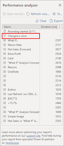
The time spent (duration) to complete the below set of tasks are included in the log information for each visual:
- DAX query – This is the time required for the visual to send the query and Analysis Services to return the results.
- Visual display – The duration of time needed to retrieve any site images or geocode before the graphic appears on the screen.
- Other – The amount of time the visual spends preparing queries, awaiting the completion of other visuals, or carrying out further background processing.
The duration (ms) numbers show the elapsed time between each operation’s start and end timestamps. Canvas and visual operations are performed sequentially on a single User Interface thread shared by multiple processes. The durations include the time spent queued while other functions are completed. The Performance Analyzer sample and documentation on GitHub explain how visuals query data.
After interacting with the report elements, click the Stop button if you want to measure the data with the Performance Analyzer. After you select Stop, the performance data remains in the pane for you to analyse.
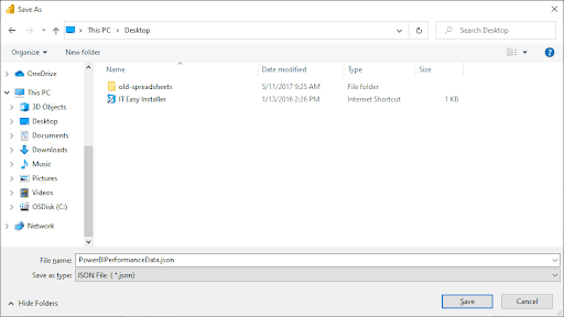
You can save the information that the Performance Analyzer creates about a report by selecting the Export button. Choosing Export makes a .json file with data from the Performance Analyzer pane.
Pro Tip: Why do we use a blank page in the Performance Analyzer
Whenever we open a report page containing the visuals and slicers, we might notice that the statistics given by the Performance Analyzer are significantly low. Significant low values are shown because Power BI Desktop uses visual and data caching similar to a web browser. To overcome these cached values of visual and data, we add a blank page to the report and then start recording the Performance Analyzer to analyse the performance of the Power BI report.
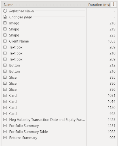
With Blank Page
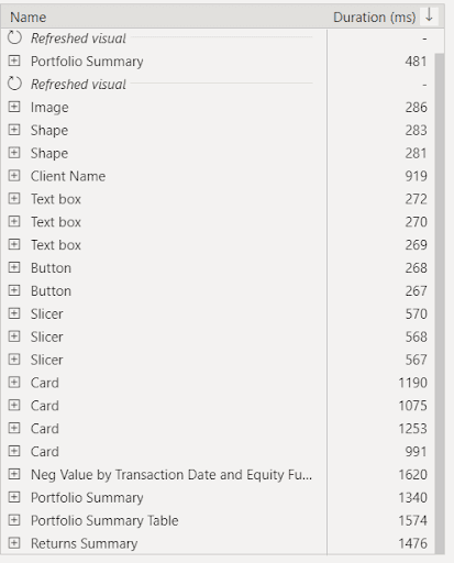
Without Blank Page(Storing Cache)


