- Stripes & Aircrafts
Stripes & Aircrafts – In conversation with Remo Masala
When you think of an airline, the word “branding” may not immediately come to mind. We’re more likely to talk about destinations, prices, comfort, or frequent flyer points. But after my conversation with Remo Masala, the visionary behind Condor Airlines’ jaw-dropping rebranding, I realized how deeply a brand can shape how we feel about a flight—and even the anticipation of a vacation.
In Brief
- Condor’s rebrand feels like a poem in motion—stripes drawn from sun-soaked towels and beach chairs now wrap the skies, turning each plane into a memory of escape.
- What began as a need for visual renewal became a deeper transformation, guided not by data but by instinct.
- “Passion is our compass” replaces playful charm with emotional depth, anchoring the brand in both nostalgia and confidence.
- More than a look, it’s a feeling—one that lives in every detail, from livery to culture, making the journey feel like a vacation before it even begins.

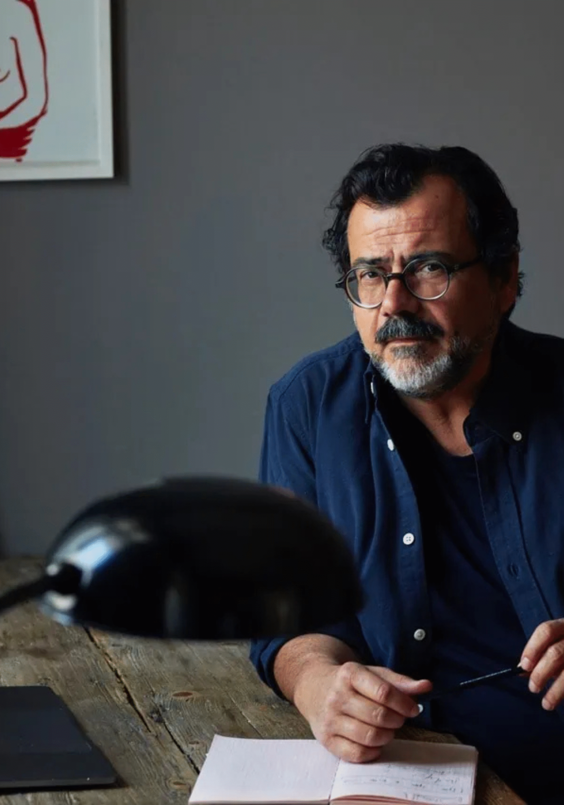
Remo is not your typical designer. He operates at the intersection of storytelling, strategy, and visual transformation. And with Condor Airlines, he didn’t just refresh airlines—he reimagined a legacy. With a career that spans Audi, Kuoni Group, and now visionary creative leadership at vision alphabet, Remo has built a name for designing brand worlds that don’t just sell—they stay.
In a world full of branding buzzwords, Remo’s work stood out because it was bold, instinctive, and deeply human. I had the absolute pleasure of speaking with him for our Knowledge Series at City & Talent.
Q: Remo, Condor is vacation and vacation is striped. Actually a simple equation – was that the basis of the idea for the striped look?
RM: Revising the brand image of Condor with its long tradition was a sensitive interaction right from the start, based on respect for the origin and the requirements for the future. Our basic consideration was: How can the Condor be given the greatest possible visual differentiation and independence? The result was the summer stripes, which at the same time represent a reference to vacation.
My take:
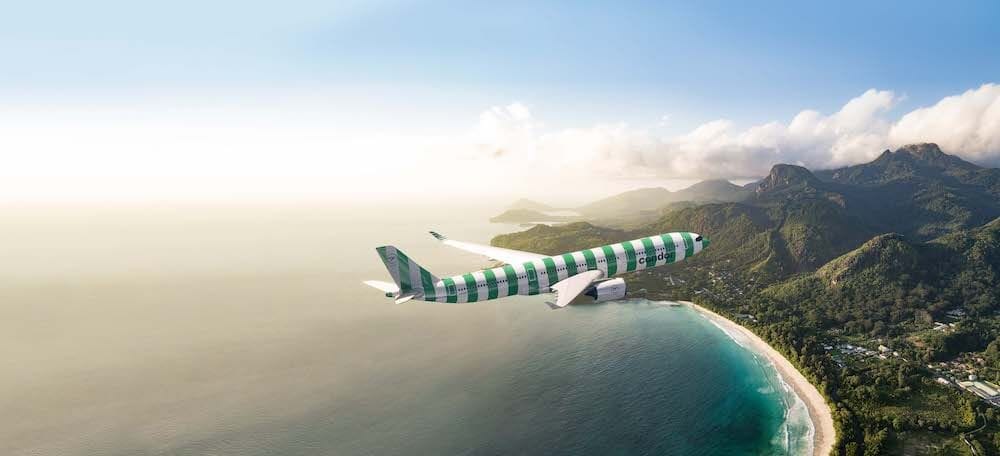
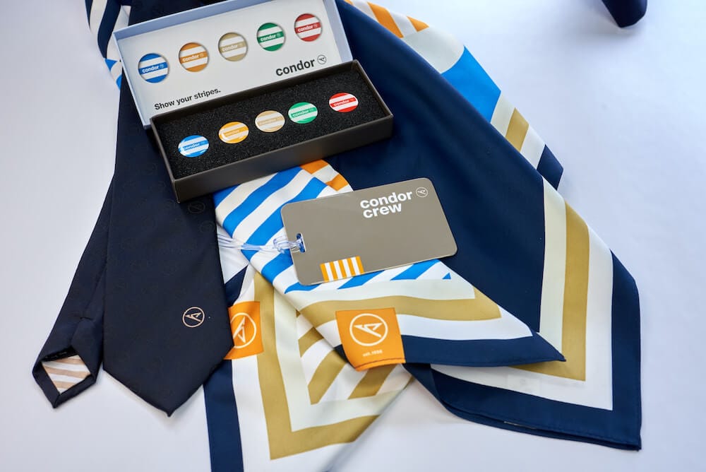
This deceptively simple idea led to one of the most iconic visual rebrands in aviation. Condor’s aircraft are now wrapped in colourful, beach-style stripes—bold vertical bands in blue, red, green, and yellow that scream “holiday!” before you even take off.
Think of beach towels, deck chairs, parasol umbrellas—the colours and patterns that define summer. By putting that aesthetic on the aircraft, Remo did something radical: he made the plane itself part of the vacation experience. The new livery stands out on any runway, Instagram feed, or travel blog. It creates instant recall, emotional warmth, and most importantly—brand distinction. When was the last time you saved a livery for your pinterest board on “Summers”? Remo has perfectly caught that aesthetic.

Q: It was, therefore, necessary to develop traditions further. Condor is a strong brand; why is rebranding the right thing to do right now?
RM: Condor has demonstrated impressive brand discipline over the years since its creation: Otl Aicher, probably the most famous German graphic designer and brand maker of the 1960s, developed the figurative mark and the lettering – since then Condor has been yellow and had the condor in a circle as its signet. This tradition was then broken by belonging to corporations at the end of the 90s. Sometimes Thomas Cook stood on the planes, then Condor powered by Thomas Cook and in the following years a colourful mix of appearances emerged. With 80 percent of the aircraft currently due for a new paint job – after all, they have to be painted about every seven years – the time was now more ripe than ever to decide on the future of the brand.
My take:
When I looked deeply into Condor’s branding, over the past 20 years, Condor’s identity had become diluted. Multiple corporate takeovers brought confusing variations—Thomas Cook branding, hybrid taglines like “Condor powered by Thomas Cook”, and a visual language that no longer felt cohesive.
This is a lesson for any business owner: design refreshes are not just aesthetic upgrades—they’re business milestones. When infrastructure, product lines, or market positioning hit inflection points, branding must evolve too.
It’s what Burberry did when they merged heritage with urban edge, and what Dropbox did when they moved from a file storage tool to a creative workspace, changing not just their look but their voice.
Q: Condor is known for their passion: We love what we do! That's why our claim for years was "We love flies!". We now have "Passion is our Compass", Why is this better suited for Condor?
RM: A new brand identity is also a further development and the beginning of a new chapter. It is true that Condor stands for passion everywhere and precisely this passion is their inner compass. The new claim goes deeper and expresses even better who Condor is and how much tradition and quality it has. Because Condor is and remains Condor – Germany’s most popular holiday airline.
My take:
Condor’s brand line was quirky and fun for years: “We love flies.”
The new brand claim “Passion is our Compass” is designed to express not just enthusiasm—but tradition, quality, and confidence guided by passion – the only thing that matters.
It’s an emotional elevation, akin to when Apple moved from “Think Different” to simply letting product design speak for their brand ethos, or when Airbnb introduced “Belong Anywhere,” signalling a deeper shift from accommodation to community.
A claim is not just a catchphrase. It’s a distillation of the soul of the company—how it wants to be perceived and remembered.
Q: A striped livery on an aeroplane was a bold move; what compelled you to rebrand a brand like "Condor" with a history spanning more than 60 years?
RM: As a creative agency, we are happy about every client who wants simple and perfect solutions for complex issues. It wasn’t just about stripes, it was about the repositioning of a brand and the understanding of the employees for this transformation. Stripes are one thing you see. Our interior design of the cabin is another important change. But the service of the staff and the culture of the company, these are the real changes that the customer feels and that make the whole thing perfect.
My take:
The stripes may be what we see, but they are just the surface of a much deeper transformation. The entire in-flight experience, from cabin design to staff culture, was reconsidered. This is critical—because a rebrand without cultural adoption is merely cosmetic. When you design for a brand – you don’t just design for products, you also design for people.
Think about IKEA. Their visual brand is minimal, but the customer experience—from store layout to product assembly to meatballs—is the brand. Condor’s transformation follows that logic. Every stripe tells a story, but every interaction confirms it.

Q: What's your take on future-proof rebranding, and how can one achieve it?
RM: There is no security in change. The best and most expensive market surveys would never have produced the change Condor has made. Many marketing staff trust too much in the opinion of surveys. This safeguards them and the expected change is mostly mediocre.
For me, market surveys are an additional element but not the driver of innovation. Innovation arises on other levels and the art of rebranding is to sense the change that is taking place.
My take:
Remo’s thought is clear: “There is no security in change. The best and most expensive market surveys would never have produced the change Condor has made.”
In other words: Don’t wait for data to give you permission to be visionary. While market research can inform decisions, true innovation often comes from intuition, cultural sensing, and the ability to read the undercurrents of change.
This echoes the moves of brands like Patagonia, which made sustainability its core message before it became a trend. Or Tesla, which didn’t wait for surveys to tell them electric cars could be cool—they decided it and made it happen.
“Innovation arises on other levels,” Remo says, “and the art of rebranding is to sense the change that is taking place.”
Key takeaways for any business:
- A clear visual idea (like stripes = vacation) builds recall and emotion.
- Strategic timing (e.g., repainting of 80% of the fleet was required) can drive big creative decisions.
- Internal culture must match external branding.
- Boldness pays off when backed by vision, not just validation.
Final Thoughts:
My conversation with Remo Masala wasn’t about aircraft design only. It was a reminder of how branding is the emotional infrastructure of every great business. Branding Isn’t Just Design—It’s Business. It’s a strategic lever for growth, differentiation, and trust.
It was an absolute privilege to engage in a conversation with Remo Masala, delving into the fascinating story of how he orchestrated a transformation in Condor Airlines’ branding, leaving an indelible mark on the world of holidaymakers and travellers.
As we take another episode of The Knowledge Series at City &Talent, we hope this story inspires founders, marketers, and creators to look beyond the surface and understand the full power of brand transformation for businesses.
Because in a world of sameness, a bold stripe can be the most honest thing a brand can wear!


